Friday, October 31, 2014

Extra Credit: Pictures in Words Tutorial


I used a beach picture as the background and then added a clipping mask so that the text would show through. This was an extremely easy tutorial, and I think it looks pretty cool. I didn't know how to make a clipping mask before and I am really glad I learned how too. I didn't really learn anything else, but it was really quick, and it turned out really cool.


Pictures in Words Tutorial

Wednesday, October 29, 2014

Shortened Music Video


This project was to shorten our first music video, and edit it a little bit better. I think my second one is better than the first, because it has less filler and is only the important shots. The first music video the only thing I was worried about was the shots lining up with the lyrics. The second time I just made the story complete, and didn’t add in extra shots to make it longer. I learned how to edit on the beat and use markers to make the clips transition at the right time so it looks like it goes with the music. The other thing that I changed was the color on some of the shots. Some of the black and white shots were kind of dark, so I had to adjust their coloring. To make them look like they fit in the video better. I really like the re-edited version of my music video.

Extra Credit: Photoshop Tutorial


I picked this tutorial because I really like the way the text looks, it is really easy and I learned something that I can apply to future projects. I really like the way it turned out and I like the font that it had me download. I learned how to add textures in the background and how to change text into a path and apply a stroke. I also learned how to edit brushes.

Fireflies Text Effect

Friday, October 24, 2014

Music Video


I had a lot of fun coming up with our music video. I learned that you have to put a lot of time into planning the video and making sure that the audio matches up with the video. I will apply the planning process and the mood board to the next project. The beat sheet and the mood board helped us come up with ideas for the story of our music video, and I think it turned out pretty well. The six shot sequence that we used throughout the video added variety to the shots and made it more interesting. The biggest challenge that we encountered was the audio not matching up with the video. Some of the shots were shorter than we planned, so we had to get creative while editing to make it match up better. I really like the story of our video and I think it turned out pretty well. Next time I would make sure that my group planned everything out better, and accounted for how long each shot was so it flowed a little bit better.

Wednesday, October 22, 2014

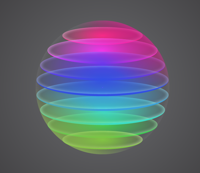
Sphere Tutorials

Photoshop Tutorial

This tutorial was really easy and fast. I really like the way it turned out. I made my colors upside down compared to the tutorial that I used, I really like the way it turned out. This one was different from the illustrator tutorial, because it was a lot less complex to make the shape, and then I just added a bunch of effects. I learned how to add gradient overlays, color overlays, and blurs in photoshop.


Illustrator Tutorial


I really like the way this turned out, it was a little difficult because I had a lot of problems with the overlays and extra gradients. Like the photoshop tutorial I changed it a little by not adding the highlights on top, because I didn't really like the way mine looked with them. I think this one was really cool and I learned a lot about illustrator while making this. I learned how to work with the  gradient tool and how to move objects exactly to where you need them to go.


Circles and spheres symbolize unity, completeness, and perfection. My workflow for this project started with sketching a sphere and doing a basic tutorial in both illustrator, and photoshop, then I found these more advanced spheres and applied the basics that I learned in the first tutorials to make the spheres more realistic, then I put all the files in a sphere folder on the server to keep them all together. Photoshop and Illustrator are very different, because in illustrator you can put a bunch of shapes in one layer, but in photoshop you have to merge the layers if you want them to be on the same layer. It is easier to select and transfer objects in illustrator, but in photoshop it is easier to separate and group objects through merging layers. I want to learn how to add more effects to the spheres and how to make them look like they are bouncing.

Links:

Red Spheres

Photoshop Spheres


Illustrator Spheres


           I like my illustrator spheres better. The tutorial that we did in photoshop was kind of pixelated, but I think the gradient is really good. I really like the illustrator sphere and it was a lot easier to create. I like the shadow better on the photoshop sphere because it looks more realistic based on the sphere's gradient. I like using illustrator more, because it lets you select anything and change the gradients easier. I think photoshop is better if you are working with a picture, and illustrator is better for creating shapes and other things from scratch.


Sketches:


Friday, October 3, 2014

Personal Logo

My logo represents me really well, because it includes the color blue, squares, and helvetica font. Blue represents loyalty and peacefulness. Squares represent stability, strength, power, balance,  and reliability. During the typography assignment, I took a font quiz, and helvetica was one of my results. My process in creating this design was sketching several different ideas, then I created a bunch of them on illustrator, and kept changing the ones I liked the best. I learned how to use the pen tool better, and also how to work with lost of art boards at the same time. I would like to learn how to round the edges of objects, on some of my sketches I had two letters coming together, nut i didn't like the way they came together on illustrator. I feel like I did really well on making it simple but unique. I would maybe try to make the letters look like negative space instead of on top of the background squares. I think it would look a little cooler, but I really like the way this one turned out too. I would probably need to work on how the shapes come together, and the color of the gradients.