Wednesday, December 16, 2015

Semester Reflection

Description

Name Plates
            This semester in Graphic Design we got to apply our skills to a bunch of different projects. I worked on a lot of different projects, such as posters for homecoming, t- shirts for Junior Committee, and t-shirts for Freshman Committee. I also worked on the projects assigned as part of the class. Our assignments were Name Plates, Expressive Typography, Branding, and Personal logos/ branding.  All of my projects are on Behance, my online portfolio.

Reaction

            My biggest issue during this semester was not being motivated by the project, or getting frustrated with the way it was turning out. Some of the projects that I was assigned were really difficult for me because I had a really hard time coming up with concepts that I really liked.  I am kind of a perfectionist and it was really hard for me to commit to a design and keep moving on. I am also really bad a sketching. Sketching a bunch of different concepts usually helped me come up with an idea, but I always struggled with expressing my ideas on paper. Two of the projects that I had a lot of trouble with were the Junior and Freshman Committee shirts. It was really hard for me to come up with concepts for these because they didn't really have a theme except for Ravens. In the end I came up with some pretty good designs, I am happier with the Freshman  Committee shirts though. I think most of my projects turned out really well in the end and I have definitely improved over this semester.

Homecoming Poster

Evaluation and Analysis

            The project that I am least happy with is my homecoming poster, I really liked the idea, but it just didn’t turn out the way I wanted it too. This project was really challenging because we could only use black, white, and red. If I had more time on this project I could probably change the way the hot air balloon looks, and then I might like it better. I am really happy with my Just Yaks Branding project, I think it looks really realistic and I had a lot of fun creating my company and branding it. I think this project was easier for me because it was later on in the year and I had more experience with illustrator. I also had a lot more time to work on the branding project and I think the quality of it is a major improvement over the homecoming poster.


Learning and Action Plan

            I learned a lot of new skills this semester, and I really think that this improvement shows in the projects that we have done this semester. I learned to not stress out as much about sketching because they only really have to make sense to me. I also learned a few places to look for inspiration if I am feeling stuck on a project. My favorite places to find inspiration are on Behance and Pinterest. I have also learned haw to do a lot of new things in both Adobe Illustrator and Adobe Photoshop. When I was working on my Just Yaks Branding project, I looked up a tutorial on how to make my logo look like it as burned into wood for my coasters. After I completed this tutorial I found some wooden coaster and used the warp and clone stamp tools to make it look like my logo was actually branded into the coasters. I learned a lot of technical skills as well as soft skills. I have learned that collaboration and communication is a really important part of the production process. I found that asking my peers for their opinions have really helped my come up with new ideas and push my concepts until they are really great. I also love to see what my peers are working on and give them feedback about their project. Collaboration has really helped me improve my projects this semester. Time Management has also really helped me produce great designs. I have pretty good time management skills and always make sure that my work is finished on time, even if I have to come in before or after school a few days to make sure I will be ready to submit my projects on time. Time management is a really important skill to have during this class and for the rest of our lives. Time management really helps me stay on task and produce really good work.

 Action Plan

            My goal for next semester is to continue to improve. I would like to continue to have better and better designs. I would also like to continue improving my technical skills and soft skills. Next semester I hope to learn ways to avoid getting frustrated with my work and get better at sketching. I really liked the last few projects that I have done and would like to continue being happy with my projects next semester. I also hope that we have a lot of fun projects to work on next semester.

Tuesday, October 20, 2015

Gestalt Principles Make Designs Unified

Summary

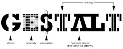
     The purpose of the Gestalt Principles, created by Max Wertheimer, Wolfgang Kohler, and Kurt Koffka, is to make a design feel more complete and connected. The six principles are similarity, continuation, closure, proximity, figure/ground, and symmetry and order.


Six Principles

1. Similarity
2. Continuation
     Continuation Article
3. Closure
4. Proximity
5. Figure/Ground
6. Symmetry and Order

Author's Argument

     The author of this article argues that Rudolf Arnheim's book, Art and Visual Perception: A Psychology of the Creative Eye, is the reason the principles became well known, and claimed that the book is a "must-have" and is worth reading.The author does a fantastic job explaining all of the principles and providing examples. However, the author doesn't explain how the principles were created. The author concludes that the principles are very important to design and should be utilized to make designs feel more complete and coherent. 

Critique

      The author's argument only supports the main points a little bit. His main argument is about Arnheim's book, but the main points of the article are the six basic principles and what effects they create in a design. The author uses very strong examples to illustrate the principles and does a good job explaining the purpose and effects of using the principles. These principles are very important for graphic designers to integrate into their projects. These principles create unity and make designs look more complete.

Wednesday, September 23, 2015

Homecoming Package Project Review


 Scope

     The purpose of this project was to create a poster and tickets that match the Homecoming theme. The Theme for Homecoming is "Trick of the Lights" based on the book The Night Circus. The client wanted something elegant and whimsical. The requested colors were black and white with little accents of red.


Process

     My process for this project started with a meeting with the client. After I got all of the information about the project I sketched 20 thumbnails. I shared my sketches with my group and they helped me pick my best two concepts to push on the computer. My group helped me pick one concept to continue to push and gave me lots of helpful feedback.


Learning

     I learned a lot about typography during this project. I learned how to manipulate the anchor points to create different illusions. I also worked with the pen tool to make the hot air balloon and learned some new tricks about the pen tool. I also learned that it is very important to collaborate with teammates because they can catch things that you wouldn't, and give you ideas that you would't have thought of. Teamwork helps make sure that the final result is the best it can be. I learned that it is very important to ask for more than one opinion to get the best results.


Changes


     If I were to do this project again, I would probably work on the hot air balloon a little bit more to make it more whimsical and elegant. I really like the tent on the bottom of the poster but I would probably try to make it look more like a silhouette and make the ground a little darker. I really like the fonts and typography that I used so I would not change that. I also really like the stars in the background so I would keep those the same. I really like the way the tickets turned out and would probably only change the ballon on the back of the tickets.


For the Future

     I will definitely use the skills I gained from this project on future projects. I will be sure to collaborate with with others and give feedback to everyone. I think teamwork is really important and I will be sure to utilize it as much as possible. I am pretty happy with the way this turned out, and I know my projects will continue to improve as the year goes on.


Friday, May 15, 2015

Video Final

Unexpected Killer

Scope:

This was our final video this year. We were allowed to either pick a short film or a journalism package. I chose to do a short film, the requirements for the project were 3 to 5 minutes in length, had to include a water bottle, a hat, an obvious source of light, and the phrase “lights out.”
I was put into a group with JJ, Sierra, and Stockton. JJ was the director and wrote the whole script. He was kind of controlling and wouldn’t listen to any other ideas about the script. I made the production calendar to keep us on task, and Sierra and I made the storyboard. JJ was in charge of casting, but couldn’t find anyone so we ended up being the actors. Stockton was in charge of all the props and he did a lot of the filming along with Sierra.
Our script was really long so we had to do a lot of filming outside of class time. The biggest issue was that not everybody could stay after school, so we had to get a little creative with our filming. It took us a long time to film, but we still had enough time to edit before the project was due. I missed a lot of class because of swimming, so I had to come in before school a few days to finish my video on time.

Experience Gained:

            I gained a lot of experience from working with JJ.  I learned how to deal with people who don’t really work well with a group, and how to deal with controlling bosses. He was really hard to work with because he was really controlling and wouldn’t listen to anyone else. I think the video would’ve been a lot better if he listed to the group and incorporated some other ideas into the story. I also learned how to improve time management since I was gone so much and had to come in to get stuff done. I didn’t really learn anything new about Final Cut Pro, but every time you work with something you get better at it so I gained some more experience with Final Cut Pro and editing videos.

Reflection:

            I am not very proud of this project because I didn’t really get a say in anything that happened in it, and I really didn’t like the idea or the script very much. I think I did a pretty good job editing the film. It was really hard to go through all the clips and pick the ones that were actually necessary. I would definitely make sure to include the whole group in the next project I do, and to make sure everyone supports the idea and the script that we film.
                If I were to do this project again I would completely change the script and make sure JJ isn’t the director. I really liked the last short film we made, but I really don’t like this one at all. If I was the director of the next project, I would make sure to include the whole group and make sure that all the shots look good and I would cast some actual actors or people outside of this calss.

Tuesday, May 12, 2015

Final Project

Burger Bistro

Project: 

This project was our final for semester 2 in graphic design. We had to make a package for a toy with a second purpose. I worked with Jacquelynn on this project. We decided to make a package for a toy burger set. Our package also serves as a burger boy hat.

Process:

We started by brainstorming ideas for our final, then once we decided what to do we made a few sketches. After we decided what we were going to do we found a template to use foe our package on a template site. After we got the template I had to add a bleed line and a die line. While I worked on the template Jacquelynn created the logo and other graphics for the package. I added the lines on the sides and the top of the hat. We printed our project out many times to figure out how to fold it, if wee needed to add more, and to see if it was the right size. Our project was really big so we started printing off smaller versions so we wouldn't waste paper.

Reflection:

I really enjoyed working on this project. Jacquelynn and I worked really well together and we are both really happy with the way the package turned out. I learned how to manipulate templates and problem solve during this project. I really like the way it turned out and wouldn't change very much about it. I love all the graphics for the package, and I really like the white space. There is a lot of white space becasue 
diner hats usually only have the stripes, but since ours is also a package we added some more fun little things to the hat. We added a name tag to the side of the hat so the kids can write their names on the hat. We also included an information panel with all the product information and the barcode. I really like our product and our package.


Thursday, May 7, 2015

Insta-Mermaid


Process: 

We started by brainstorming ideas for a product that could be sold in a bottle, then we created a logo and a brand. I worked with Jacquelynn Turnage to create our brand and our boxes. I did most of the template work and put the artwork onto the box, and Jacquelynn did all of the logos and other graphic stuff.

Experience Gained:

I learned a lot about packaging, templates, and Illustrator during this project. I learned how to make a template for a package and how to customize it. I also learned how to work with linked files and 3D revolve in Adobe Illustrator. I am really proud of this project and wouldn't change very much about it.


Reflection: 

I really enjoyed working with Jacquelynn, we are are really good team and never got in an argument. We both had equal say in all of the designs and I am really happy with the way it turned out. I really like working with packages and I am really excited to work on the final with Jacquelynn.

Monday, April 20, 2015

Trapped Video

My Night at eMagine


 eMagine 2015

I had a lot of fun at eMagine this year. I went with a lot of my friends that are in e-Comm and really enjoyed seeing all the participants' projects. I thought it was really cool how so many other schools participated. The guy who was sitting in front of me won two pixels! It was also really cool to see all the people that participated and won from our school. I took a few pictures on my phone and then I found a picture of me walking in on the website. I thought it was pretty funny so I decided to include it. I really enjoyed the creative atmosphere at eMagine and I am really excited for next year.


Friday, March 6, 2015

Movie Poster

Wreck-it Ralph Movie Poster

Process:

     I started this poster project by looking at posters by Saul Bass, and then I selected my movie and drew a few sketches. After I started creating my poster in photoshop I decided to make the bricks blend into the background instead of sticking out, and I think it looks really cool and more like a Saul Bass poster. I found the fist on google images and it was labeled for re-use, and I really like how it is an outline and you can see the bricks though it. The cooled part of this poster was the candy cane letters. I took picture of a candy cane and I turned it into the three candy cane letters, I think they look really cool. 


Saul Bass Movie Poster

Reflection:

     I chose to do the movie Wreck-it Ralph, because it is my cousins favorite movie and I have watched it a million times with him. I also chose it because it has a really cool plot, and I thought I could make a really cool poster about it. My favorite part of the poster is the bricks in the background, and the candy cane letters. If I were to do this project again I would probably pick a different font because I doubled up on the bricks, and I would try to pick a different element of the movie to allude to with the font. I really enjoyed this project and would love to create another movie poster, or do another project related to this one. 

Friday, February 27, 2015

Custom Name

I used Adobe Illustrator to make my name look like it is connected all together. I used the sill I learned during the apple organics tutorial. First I typed my name and adjusted the kerning, then I turned all the letter into outlines and adjusted the anchor points to make it look like all the letters were connected together. I think this looks pretty cool, but the font I picked is kind of boring so if I did this again I would pick a better font and maybe alter the font a little bit more. I learned a lot of valuable skills that I an use to make the title for my movie poster.

Tuesday, February 10, 2015

10 Things


 Values and Consumption: 
      I learned that peoples values have a huge impact on their consumption, and designers really have to tap into people's emotions and values in order to get them to buy the products.

Indesign: 

     This was my first project in indesign and I learned a lot. I learned how to use character styles, paragraph styles, and object styles. I also learned how to create a grid and use object boxes.


My Poster: 
     I learned a lot while making my poster and I changed a lot of things throughout my process. I changed the spacing between each box and the size of the box so that it looks more consistent  and I changed the leading on the copy so it is easier to read. I like all my pictures and I am pretty happy with the way everything turned out. If I did this project again, I would make it more colorful, I like all the white space, but I think it is a little bit boring.